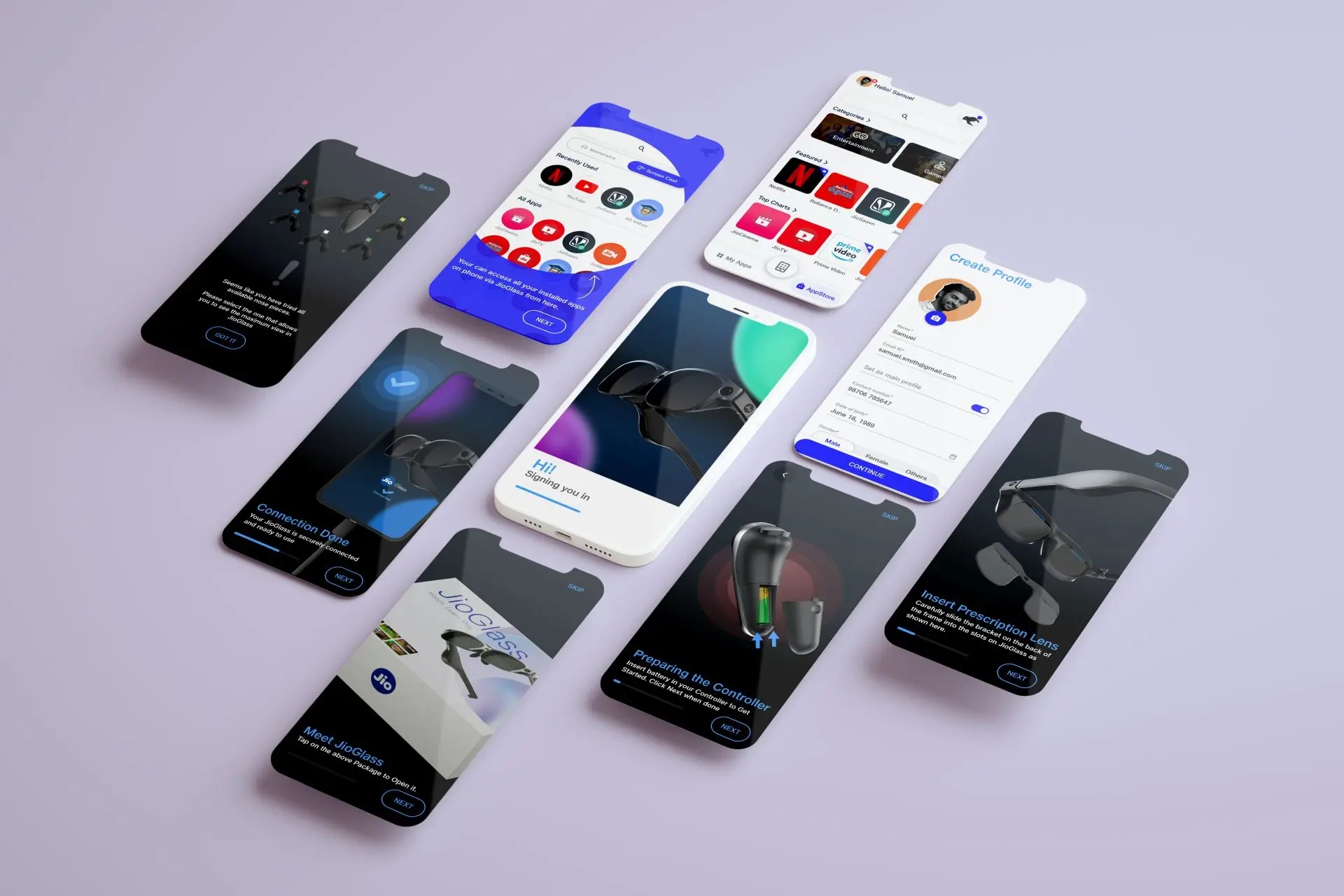
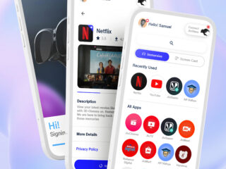
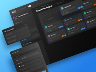
Virtual Controller
Virtual Controller is a digital replacement for the physical controller
of JioGlass, a mixed reality device, powered by mobile phone.
Context
JioTesseract developed the Companion app, which serves as a digital instruction manual and command center for managing apps and settings. However, test users described the experience of using the device as “cumbersome”. The challenge was to simplify the system while preserving its current functionality and minimizing development overhead.
Background
In late 2021, Tesseract completed the alpha version of its companion app and other elements of its ecosystem, allowing for end-to-end user experience testing. The goal of these tests was to assess the app’s ability to guide users through device setup, identify any potential drop-off points and usability issues.
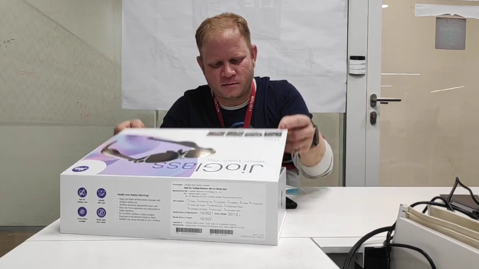
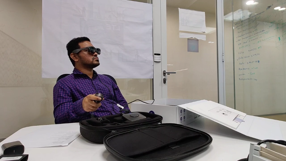
Moderated observations were conducted to test the user experience. Participants were presented with the device in its packaging and asked to interact with it. They were given three tasks: setting up the device, installing an MR app, and running an MR app. The time taken to complete each task and the success rate of each task were used as metrics.
Observations and feedback:
Low Confidence:
On average, the device setup took longer than expected, with almost every user struggling to pair the controller to the phone and understand its purpose. This was reported as the most frustrating part of the task. Additionally, users described the experience of using the device as cumbersome, feeling overwhelmed by the number of tasks they had to handle at once.
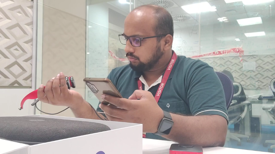
“I think I’ll have to look at instructions many times.”
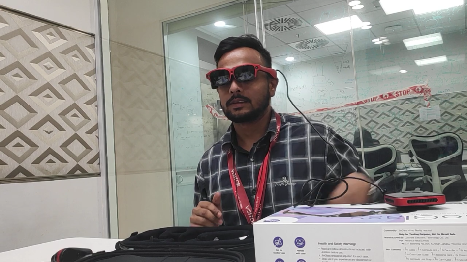
“I don’t usually read manuals and instructions, so I skipped it here too. And then I just couldn’t understand what connects to what.”
Click on image to see full recording
Hardware Problems:
Upon further investigation, we (the product team) identified several issues with the controller. The controller had tracking issues, frequently disconnected, and had a drifting issue that caused the pointer to be oriented differently than the controller. To address these issues, we implemented a reset feature that the user had to perform every few minutes. Left-handed users found the controller uncomfortable to hold due to the volume buttons being in the way. The controller was designed primarily for right-handed users.
“It is one more remote to lose every time I want to just enjoy.
One more thing to remember to put batteries in”
“I don’t understand why the pointer isn’t pointing where I am aiming.”
“I don’t like resetting again and again. I kept losing the game because it was not pointing where I was!”
“I accidentally pressed the volume button. I don’t think left-handed people like me would like that. It’s not as comfortable as in my right hand. This is clearly not made for everyone to think.”
Users initially liked the design and overall appearance of the controller, but their satisfaction decreased after using it. They reported feeling less confident about using the device.
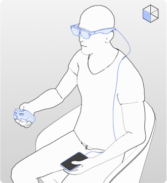
Current system

When set up correctly, the Glass would be tethered to the phone via USB and the controller via Bluetooth. It was this 3-point system that made the device cumbersome to use.

Problem Statement
How can we improve the overall user experience by simplifying the system and increasing user confidence in using the device, thereby encouraging repeated usage?
Solution
A virtual Controller module within Companion App
After determining that the controller was causing complications and contributing to user dissatisfaction, I examined alternatives to the controller. I compared our solution to existing remote solutions, such as using a phone as a remote for a TV when the primary remote is not available. Based on this parallel, I decided to use the phone as a controller for our solution.
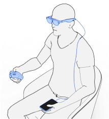

Going from a 3-point system to a simpler 2-point system when the phone becomes a controller.
Advantages of a Virtual Controller:
Understanding the Controller
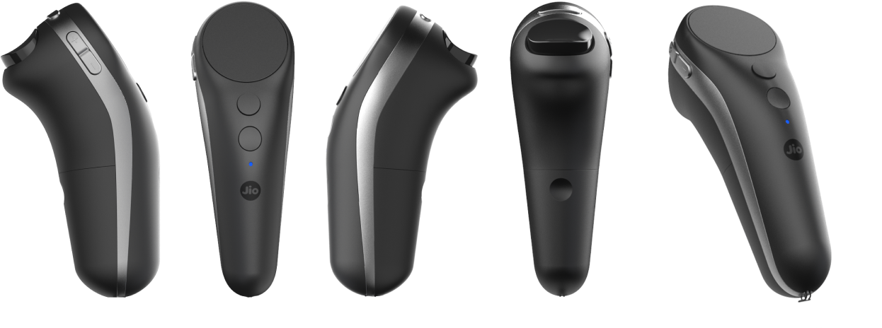
The controller has 6 buttons and one trackpad. Each button can perform two actions, click and long press. This way in total 12 actions could be performed.
The actions are detailed in the following diagram
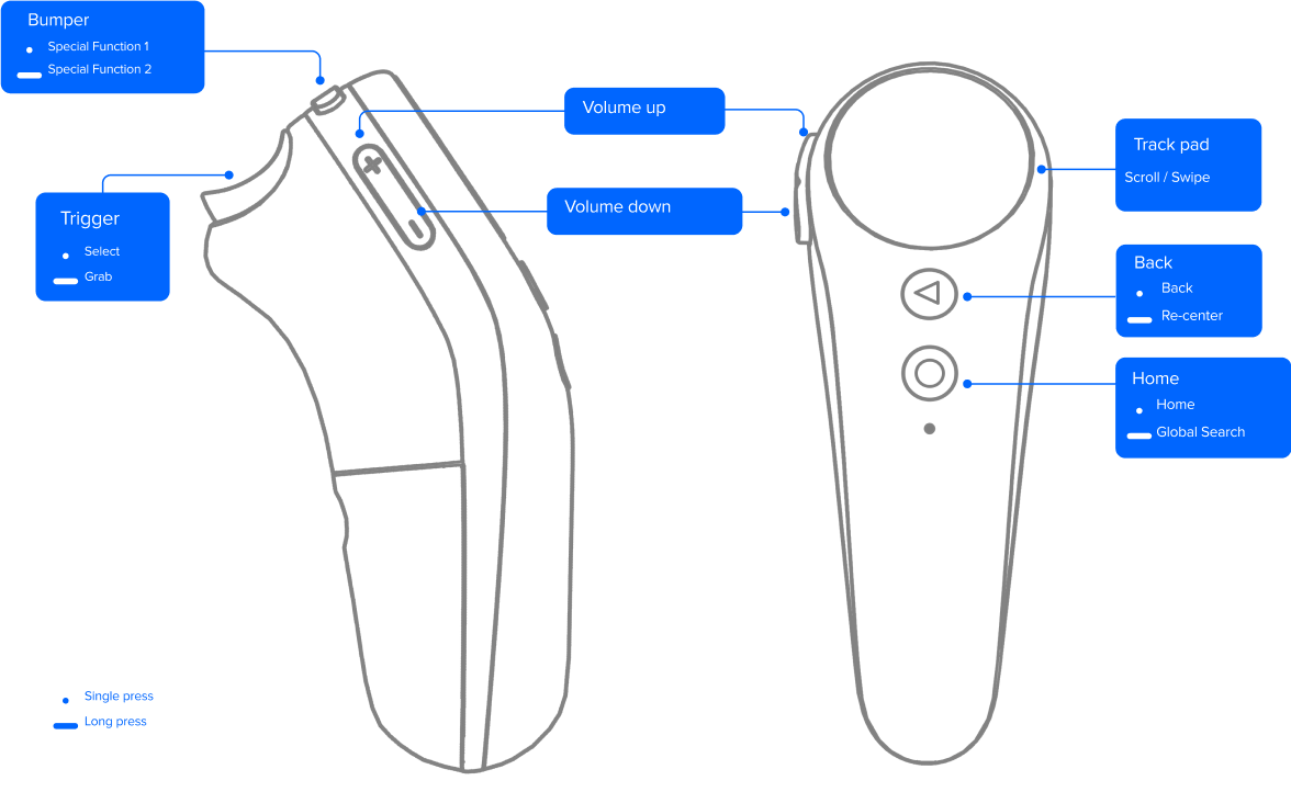
All the buttons except volume controls were to be mapped on the Virtual controller. A few extra features were also added and considered like –
- A firsts time tutorial
- The ability to switch layouts for left-handed users
- A quick app drawer for accessing favorite, recent, or active apps
- A button to return to the Companion app home
- Toggle haptic on /off
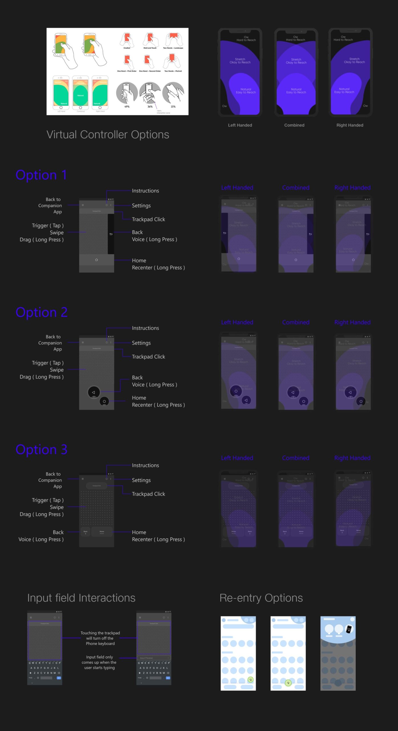
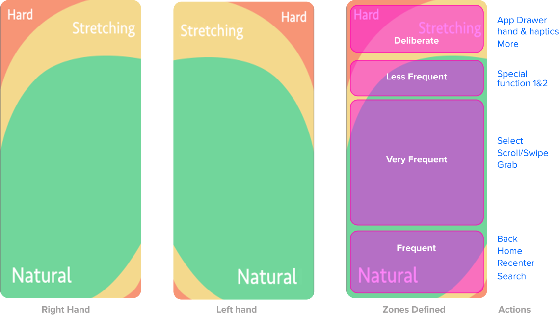
The physical controller’s buttons were easy to understand and use without looking, due to tactile feedback. However, on a phone screen, there is no tactile feedback, making it difficult to accurately tap the correct button without visual confirmation. To address this issue, I looked at existing studies on thumb reachability and defined zones to understand how I should approach this.

I ranked all the controller actions based on the frequency of use, with the most frequently used actions placed in the most accessible areas and less frequent actions in areas that required more deliberate effort from the user. This allowed me to optimize the layout for ease of use.
Design
Version 1
Exploring Layouts
After identifying the zones based on thumb reachability, I began exploring various layouts that would accommodate all actions and the new requirements.
Though a start, these layouts felt a bit dense and prone to mis-clicks. I had to simplify the layout. To understand how I focused only on the most important actions rather than frequent actions and did a test.
Taking Swipe, Click, Back, and Home as the main actions I mapped them to a rough layout for a quick test to validate the zones. For this test, I used a sketching app on a phone and overlayed the layout on top of it. Users would only see the layout and their touches would be recorded underneath by the sketching app.
I called out 30 actions at random and users were to perform those actions. This was performed with 7 right-handed and 3 left-handed users. The results gave me a crude heatmap of areas on the screen that users were touching for a given action.
This helped me in understanding the size and placement of such actions and also what users would tend to naturally do for a given action. Now I could redesign the layout as per this data.
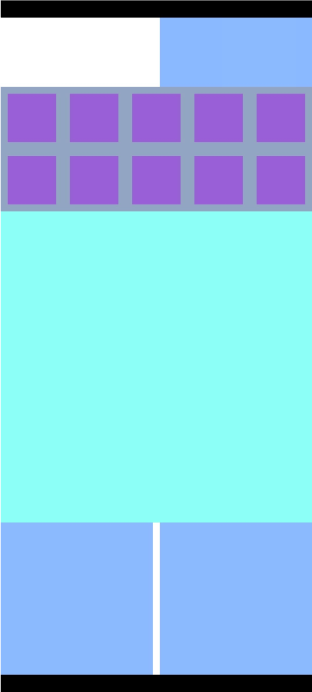

Through this testing, I learned that in order for the virtual controller to be used without looking at it, the layout should be minimal and buttons should be spaced far apart with a large click range. Using different sizes for buttons can reduce mis-clicks. Additionally, the controller should be dark to prevent users from being distracted by the phone screen while playing games or consuming media. Based on these learnings, I iterated with refined designs.

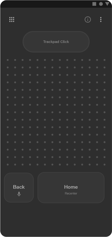

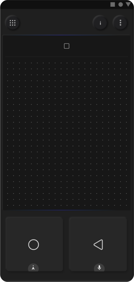
I evaluated the revised designs through accuracy testing, in which I asked users to perform a sequence of 30 actions and recorded the number of mis-clicks and retries. The following observations were made:
Option A: Users found it easy to distinguish the home and back buttons without looking, but frequently triggered the back button while attempting to swipe or scroll.
Option B: Users frequently hit the home button while trying to access the back button.
Option C: While slightly intimidating at first, users were able to hit the home and back buttons accurately with this layout. However, they frequently hit the home button while performing a basic click.
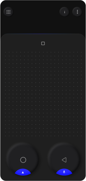
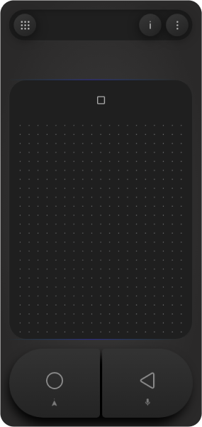
Option D: Despite its simple appearance, the button distinction in this layout was most evident. Long press actions were also easy to remember and perform. This layout had the lowest number of mis-clicks.
Overall Option D was the best performer among all the layouts and was selected to be implemented with some further UI explorations.

See UI explorations


Version 2
Room for improvement (another approach)
Although option D performed the best in accuracy, there were still mis-clicks. To eliminate mis-clicks and enable the use of the virtual controller without looking at it, designing it as a remote would not be sufficient. I needed to explore alternative interaction methods.
The majority of mis-clicks occurred on the bottom controls, which included four actions: home, back, search, and recenter. I considered the possibility of mapping these four actions to four sides of a radial menu with four sectors. Some sort of action could trigger the radial menu, and then a swipe gesture in a particular sector would trigger the corresponding action. This type of interaction is commonly used in 3D software such as Maya and Cinema 4D, as well as in some video games for accessing player inventory.
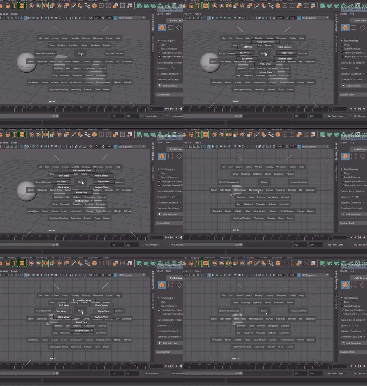

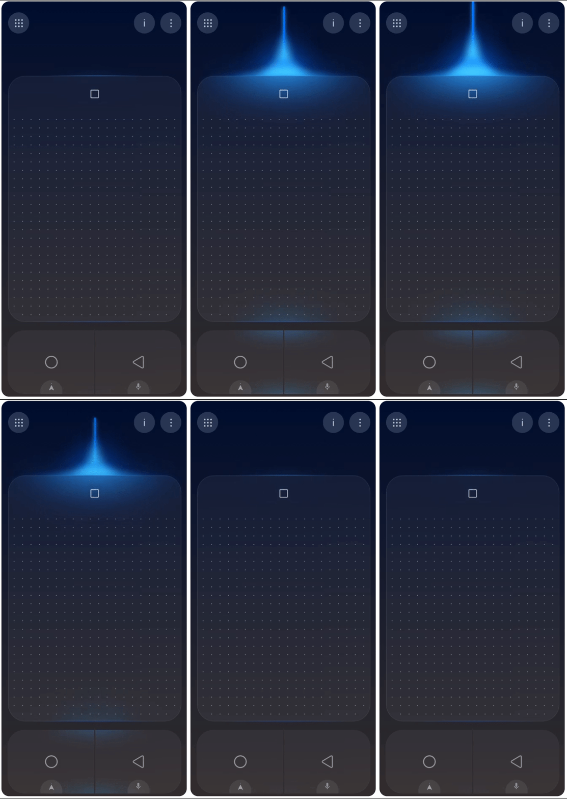
Upon playing around with the idea for some time I came up with the following solution:
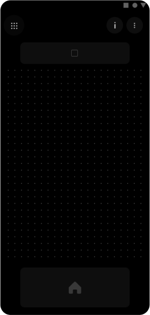

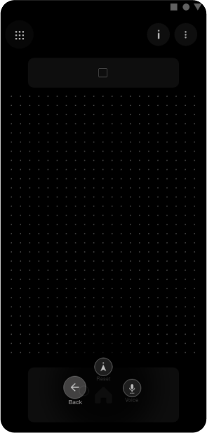


I believe this method has several advantages compared to the previous methods:
- It reduces the density of buttons on the screen even further.
- There is only one button in the lower area, eliminating the possibility of mis-clicks.
- After a few attempts, it is easy to remember and perform actions.
- The hold and swipe gestures allow users to perform actions without looking at the phone.
- A feature could be added to allow users to customize the placement of buttons according to their preferences.

Although the team and stakeholders liked this solution and saw its potential, I was unable to test it due to development restrictions. The physical controller’s buttons were mapped to click events. Changing these to swipe gestures and additionally detecting the direction of swipe would have been a significant development effort with need to modify the APIs in use. This could have ripple effects and cause errors in other parts adding further efforts to testing and debugging.
Therefore, the team decided to proceed with the first version, even though everyone agreed that version 2 with gestures was superior. Version 2 was planned for a future release once the engineering and development constraints had been addressed.
Final Designs
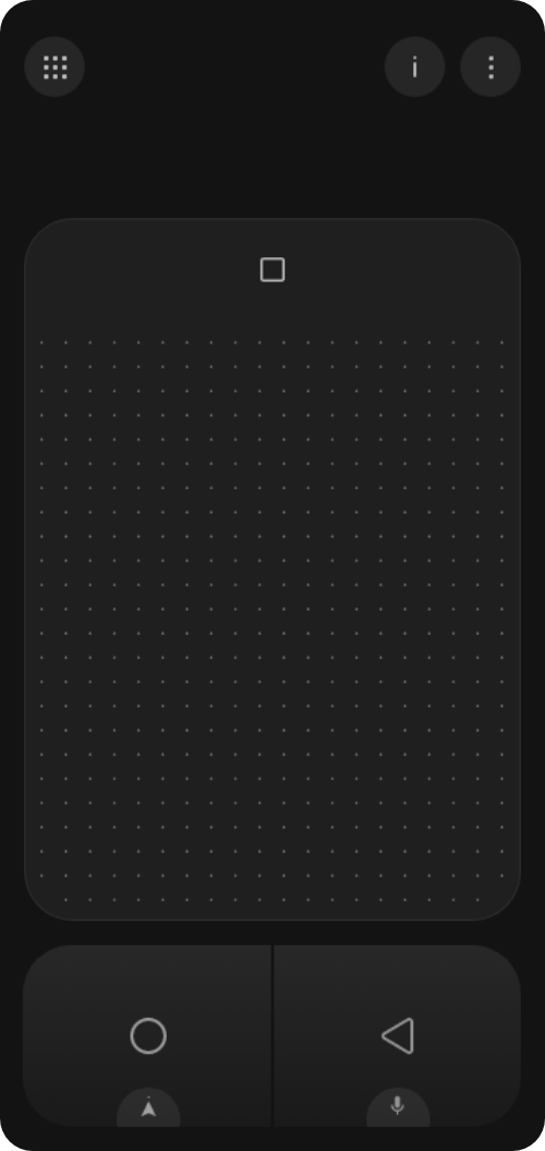
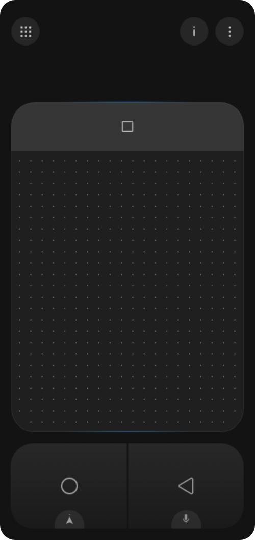


Tutorial screens
Changes in JioGlass App
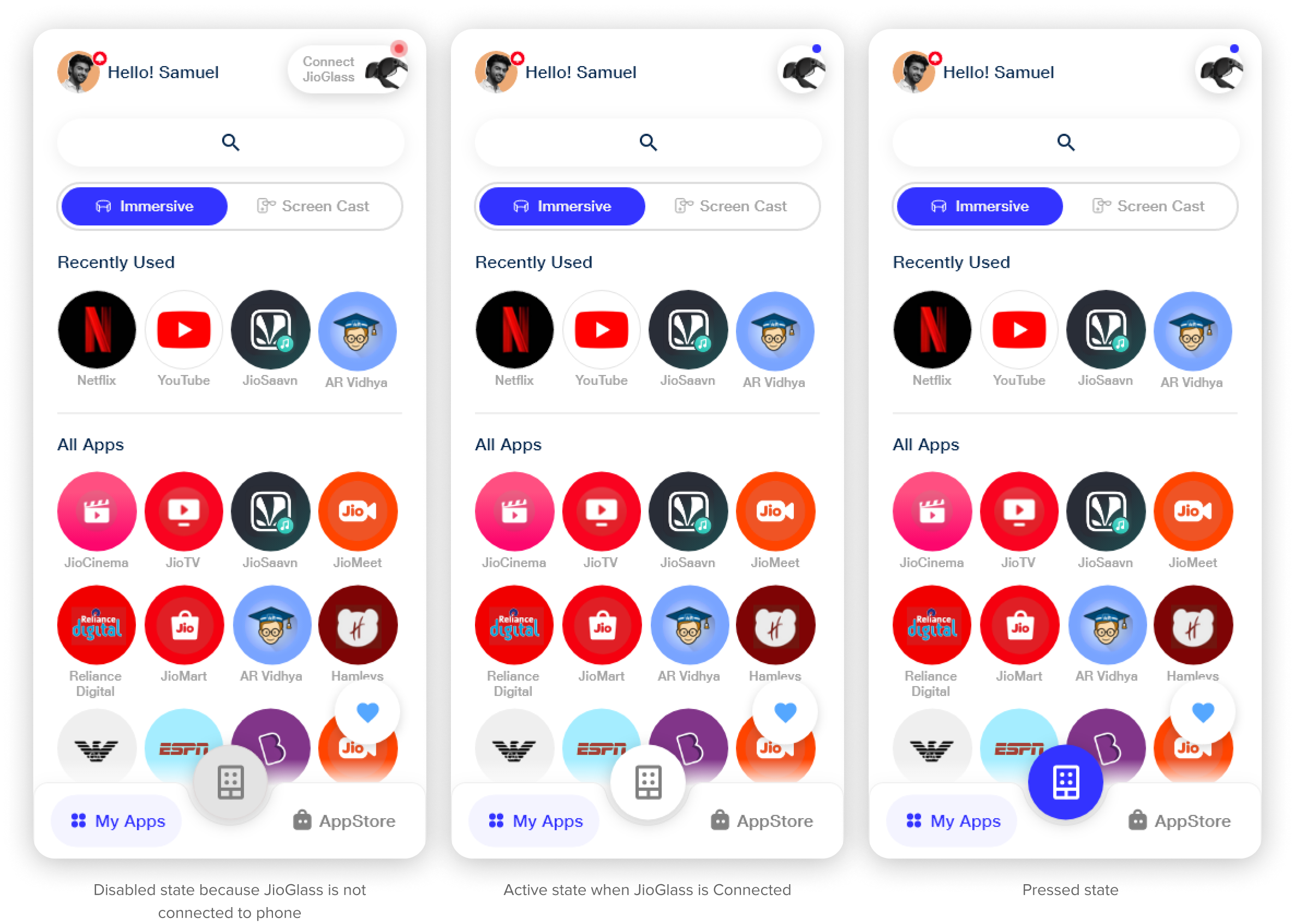
In the JioGlass app, the virtual controller was at the same level as the app drawer and app store in the information architecture. To communicate this to the user, I considered placing it within the bottom dock, but ultimately decided on a different approach. The button is easily accessible and clearly conveys that the virtual controller is at the same level as the app drawer and app store, but distinct from both of them.

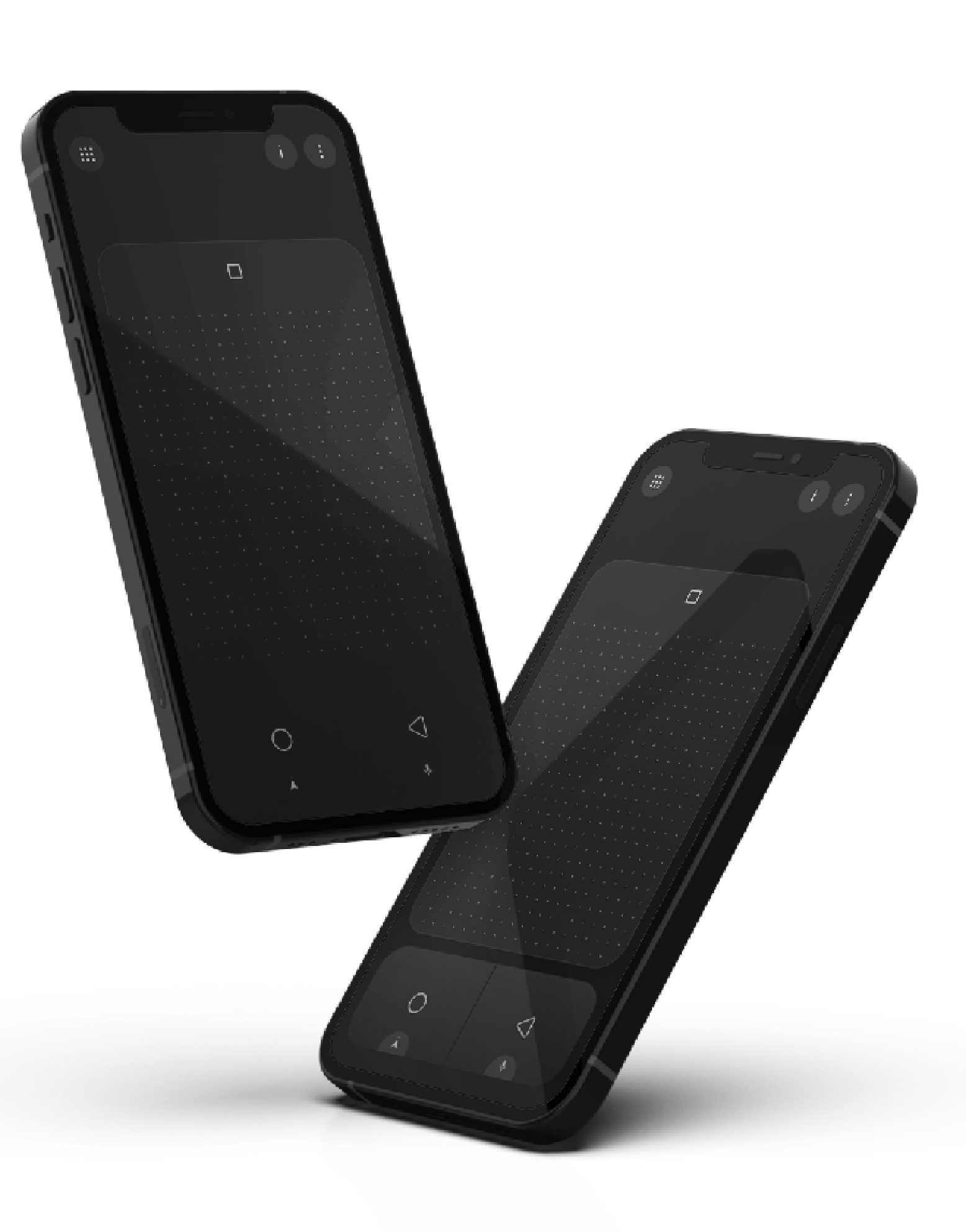
A cool version just for fun 😋


Reflections
The virtual controller project was initially undertaken to address issues with the physical controller. However, it ended up having a much bigger impact on the overall user experience than we initially realized.
Impact:
- The virtual controller significantly improved the overall user experience by making the device easier to use.
- It increased user confidence and usage instances.
- It streamlined the device setup instructions and eliminated the need for controller-related features, code, and APIs, making the app lighter, more stable, and more optimized.
- It reduced hardware, packaging, and shipping costs, leading to a lower overall product cost and wider adoption of the product.
Learnings
One of the key takeaways from this UX design project was the importance of simplifying the customer experience and increasing user confidence. By streamlining the device setup process and eliminating the need for a physical controller, we were able to make the overall experience more intuitive and easier for users. This is a crucial aspect of UX design, as it helps to ensure that the product or service is accessible and easy to use for all users.
Another important lesson learned was the extent to which UX design can apply to physical product design. This project required me to consider the physical characteristics of users, such as handedness, and to design a virtual controller that could be used by both right-handed and left-handed people. This experience showed me that UX design principles can be applied to both digital and physical products, and that it’s important to consider the user’s physical experience when designing a product.
Finally, I learned that not all ideas make it to the final product. While it can be frustrating when an idea doesn’t make it to the final product due to constraints out of our control, it’s important to work with the team to deliver the best feasible solution. This sometimes requires making tough decisions and moving on from certain ideas.


