JioGlass App
A companion app to India’s first commercial
Mixed Reality glasses.
Overview
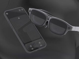
Reliance Jio is on a mission to establish the largest Metaverse ecosystem in India. In pursuit of this goal, the company has initiated the development of Mixed Reality Glasses (JioGlass) and a content marketplace for consumers to engage with the Metaverse.
The JioGlass App serves as the companion app for JioGlass. It manages and facilitates all the underlying services and APIs required for the proper functioning of the hardware.
As part of the product team, my role was to design a user experience for the Minimum Viable Product (MVP) that would be subject to the early user and market testing.
Company
Jio Tesseract
Role
UX, UI, Prototype, Product renders
Team
1 UX & 2 UI Designer
2 Product Manager
6 Android & 4 Unity Developer
Duration
12 weeks
Challenge
Design a cohesive customer experience that –
- Guides the user through device setup
- Introduces consumers to mixed reality
- Enable consumers to use mixed reality applications
Process
Our objective was to create and improve an MVP in a short time, that is useful, high quality, and easy to use. I took the Double Diamond approach of Discover, Define, Develop and Deliver so that we can iterate on fully functional versions.

Discover
Secondary Research
I started by analyzing the global players, their offerings, and their weakness so that I could use those as starting points. Studied how these players have set up their ecosystem and customer-facing touchpoints. What are the components of their ecosystems, how are they placed and what does it tell about their strategy?
We focused on factors like –
- How do they handle onboarding for novice users?
- How do they offer content?
- Do they have a platform similar to ours?
- How comfortable and confident do new users feel?
- What happens if users are stuck and cannot proceed?
ONLINE REVIEWS & FEEDBACKS
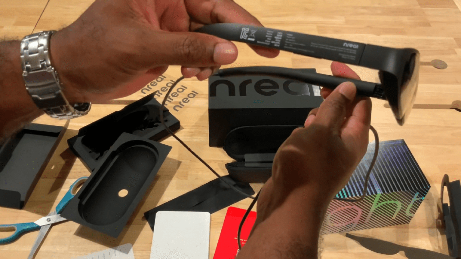
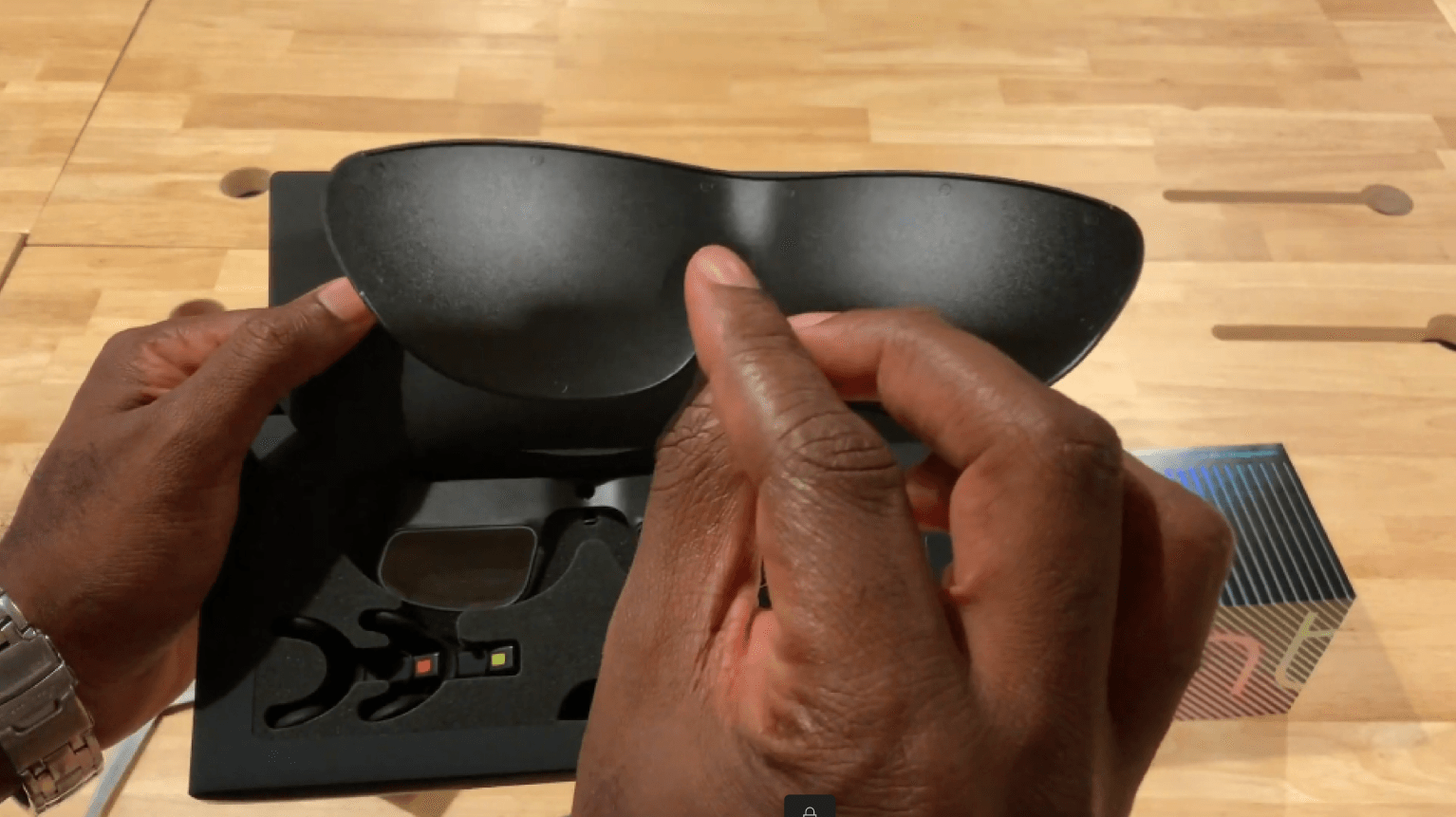
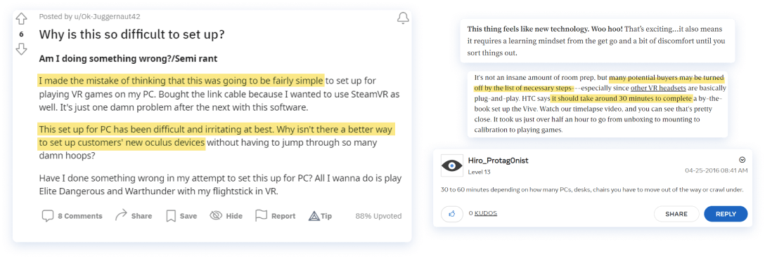
I had access to only a few of our competitor’s products, so I turned to online reviews and unboxing and setup videos made by early adopters. I closely examined any issues or difficulties they encountered and made note of these observations.
Observations
During my research, I identified a few recurring issues, themes, and user behaviours that could be used as guidance for determining which features should be included in the MVP and subsequently tested with users.
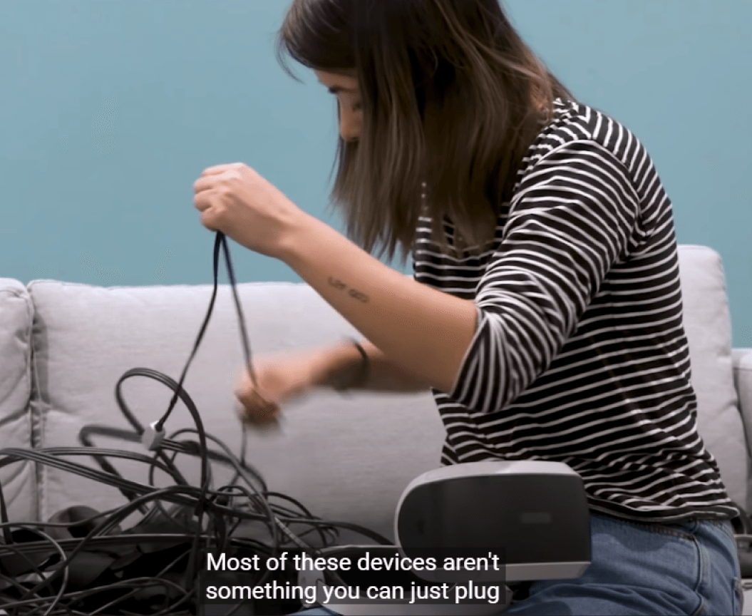
The devices are difficult to assemble or unfamilliar to most users.
As I discovered, the majority of the devices required assembly in a specific order, which led to a trial-and-error process for users to complete. Many users complained about the time it took to set up the device, particularly those with multiple components such as headgear, compute unit, and controller. Given that our device has similar hardware, it was crucial for us to make the assembly process as straightforward as possible. As a result, we decided to focus on reducing the time required for assembly and onboarding as key metrics to improve.
Finding more apps is not always easy
- A significant number of devices currently available are geared towards developers and require the installation of apps using development tools or consoles on laptops. This process is not accessible for the average user.
- Even developers prefer the convenience of inbuilt app stores, rather than having to install apps from laptops.
Users wanted to access the apps and content on their phones and laptops
- Transitioning seamlessly from immersive content to mobile apps and vice-versa was not possible in most cases.
- Usually requires elaborate setups and third-party applications.
People share the devices
We observed due to the high cost of the device, it was shared among users like in their family so even though the product was envisioned as a personal device, it was a family device being used in a personal capacity.
Very few personalisation options
We found a few features and ideas repeating among the competitors, like step-by-step guidance for onboarding, utilising an app store either native or existing for content, profiles for multiple users, support and help, etc.
We listed the features and offerings some competitors provided that may solve the questions we had going in. We considered any feature that would be feasible in our timeline and did a deep dive into each competitor’s ecosystem.
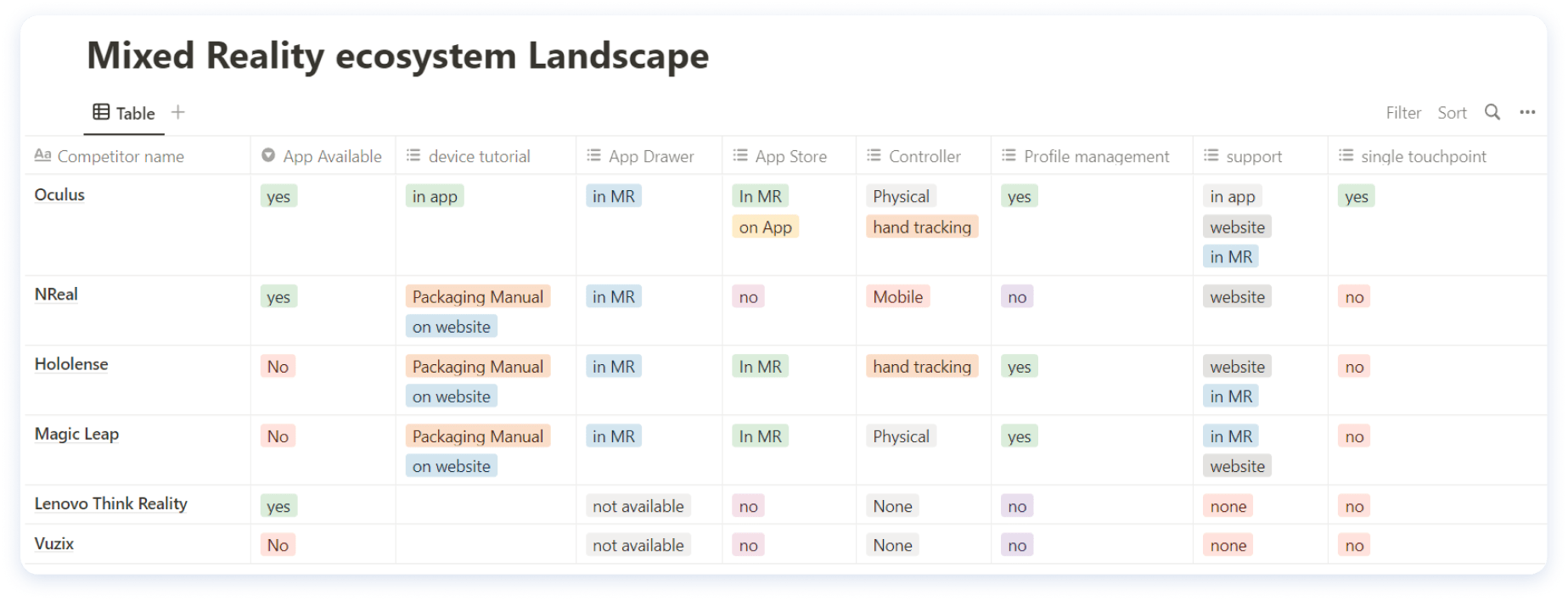
Competitive analysis
I tried a few AR/VR headgear, including the Oculus, Magic leap, and Lenovo Think Reality. For others, we looked at available online information and walkthrough videos.
I evaluated our competitors on the parameters identified earlier and compared the comprehensiveness of their ecosystems for users. Oculus emerged as the clear winner, as it was the only company that provided all the features at a single touchpoint, through a companion app. This greatly reduces friction for users.
Define
Solution
As a solution, we decided to create a Companion App for the device, which would serve as the one-stop-shop for everything a user might need, from content to personalization to support – all for a smooth and uninterrupted experience.
And since we already needed a mobile app to run the software services for the glass, we could use it as a platform to offer even more features.
Feature List
Guided device set up
Build a comprehensively guided onboarding experience by providing guides, nudges, and a tutorial section for step-by-step instruction on how to set up and use the device.
Dual App Drawer
An app drawer for compatible apps. The system is capable of running immersive MR experiences as well as running native mobile apps. So a place that could host and categorize all supported applications would be good for a seamless experience.
App Store
Bundling apps was not possible and any bloatware is not taken positively by users. Normally an app store is a separate app where users have to exit the service that is running MR. This would create an interrupted experience. So we decided to build the app store access within the service app.
Help and Support
We acknowledged due to unfamiliarity and a higher number of assembly parts users would find it difficult to use the device. They might need to look at onboarding tutorials again if stuck. So help and troubleshooting options are important for now.
Profile Management
Due to the high device cost, it was shared among users. Each user would like to personalise as per their needs. This could help us gather user-specific analytics as well. So profiles were important.
Device Status Section
To see and manage the connectivity and battery status of each component.
Develope
Optimizing the Device Assembly Process
In software, we could let the users know if something is wrong and guide them to a possible solution. But for the physical part of the customer experience, it is not possible to do so.
The device, as it was, had too many parts to put together. Sure, you could put it together in any order, but if you weren’t familiar with how these systems work, it was easy to get stuck. So, we had to find the best way to put it together – a sequence that, if followed correctly, wouldn’t lead to any dead-ends.
We tried different ways of putting it together, and we recorded all the problems we ran into. Eventually, we found a way that worked best. We made sure the packaging had big, obvious instructions to download the app, and we wrote a user manual. We even had some team members who were not familiar with the device try it out, and this sequence worked best for them too.
In this process, we identified the controller as the most problematic component. The product team started a parallel track of effort to solve this. But for MVP we continued working with this version of the hardware.
Defining the user flows
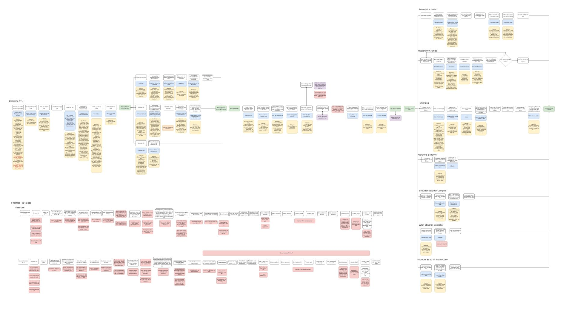
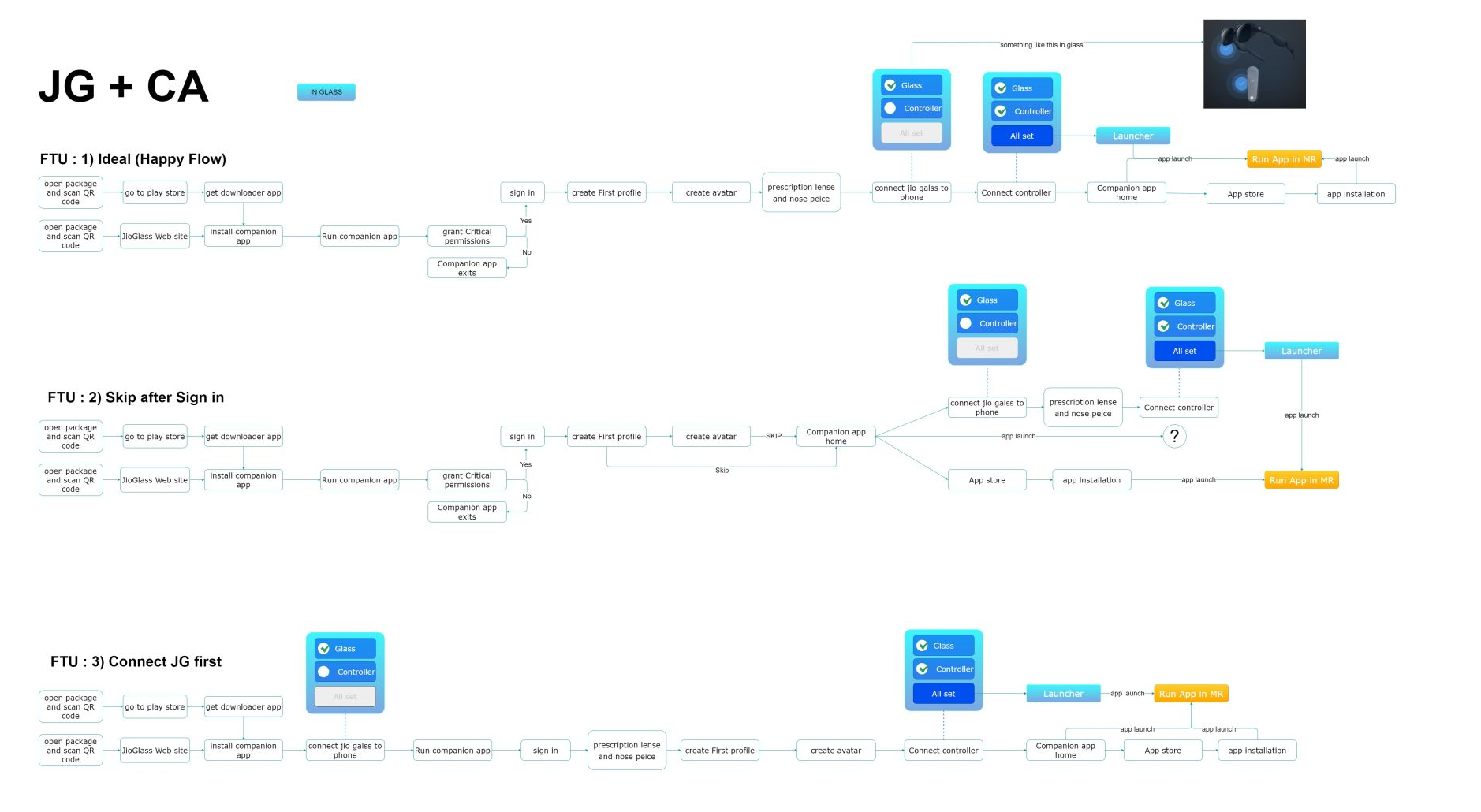
So this one was different than what I normally used to. in this case, we had to define user flows all the way starting from unboxing to assembly then to using the device and finally shutting down and storing it in the case. This was exhaustive and had to go through many iterations.
Information Architecture
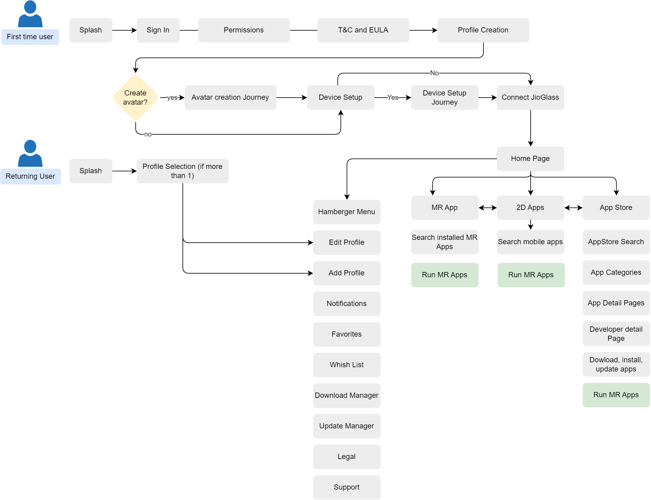
I always begin design only after defining its information architecture. It helps me and stakeholders understand how different aspects of the app relate to each other. I like finding and defining clear hierarchies. At this stage, I involve the head of engineering to ensure the design and engineering architecture are as similar as possible. I approach making information architecture as a site map too.
This helps me save time and brings every stakeholder on the same page by showing clear hierarchies and flows.
Wireframes & Explorations
Once there was clarity and agreement on features, flows, and architecture, it was time for wireframes. While wireframing, I had two goals:
- Making sure to cover all major happy flows.
This was essential to develop an MVP that we can use to perform some user testing as soon as possible. - Use as familiar UX patterns as possible.
For good adoption and retention rate. Designing any novel interactions or flows could lead to user dropoffs.
I kitbashed the key screens with the lead developer and product manager. While I detailed the design developers could use this as a reference to build the backend.
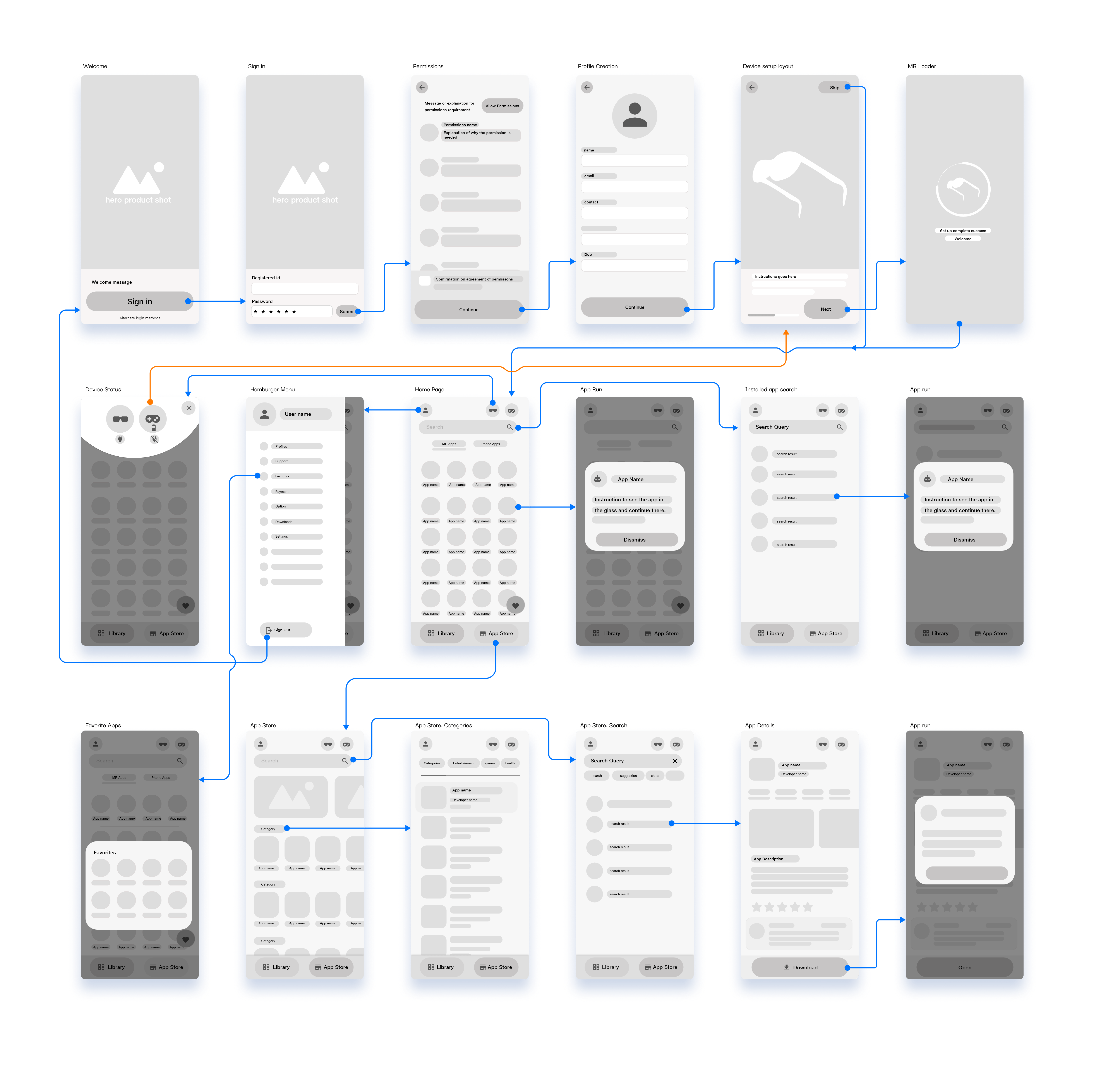
Wireframes
I created wireframes of important user flows and prototyped them using Adobe XD. These flows were then tested internally with team members who were not familiar with the project. They were given a task prompt and asked to interact with the prototype without any hints.
The test was conducted on 10 individuals, each completing 5 task flows, resulting in a total of 50 attempted task flows, with 37 successful attempts. This resulted in a success rate of roughly 70%, which was sufficient for us to proceed with the visual design for the MVP.
Deliver
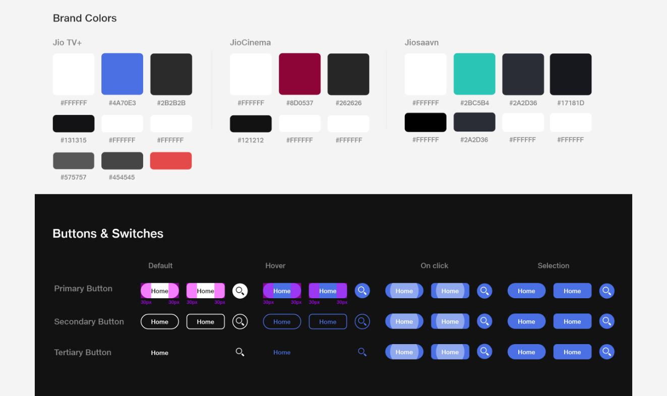
Style Guide & Design System
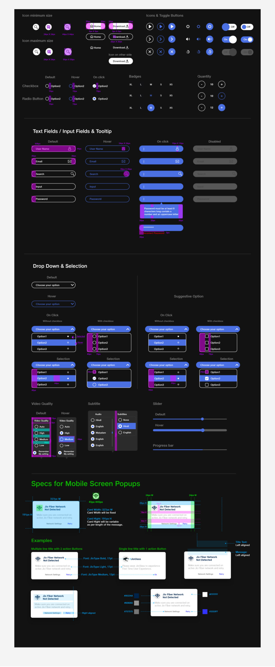
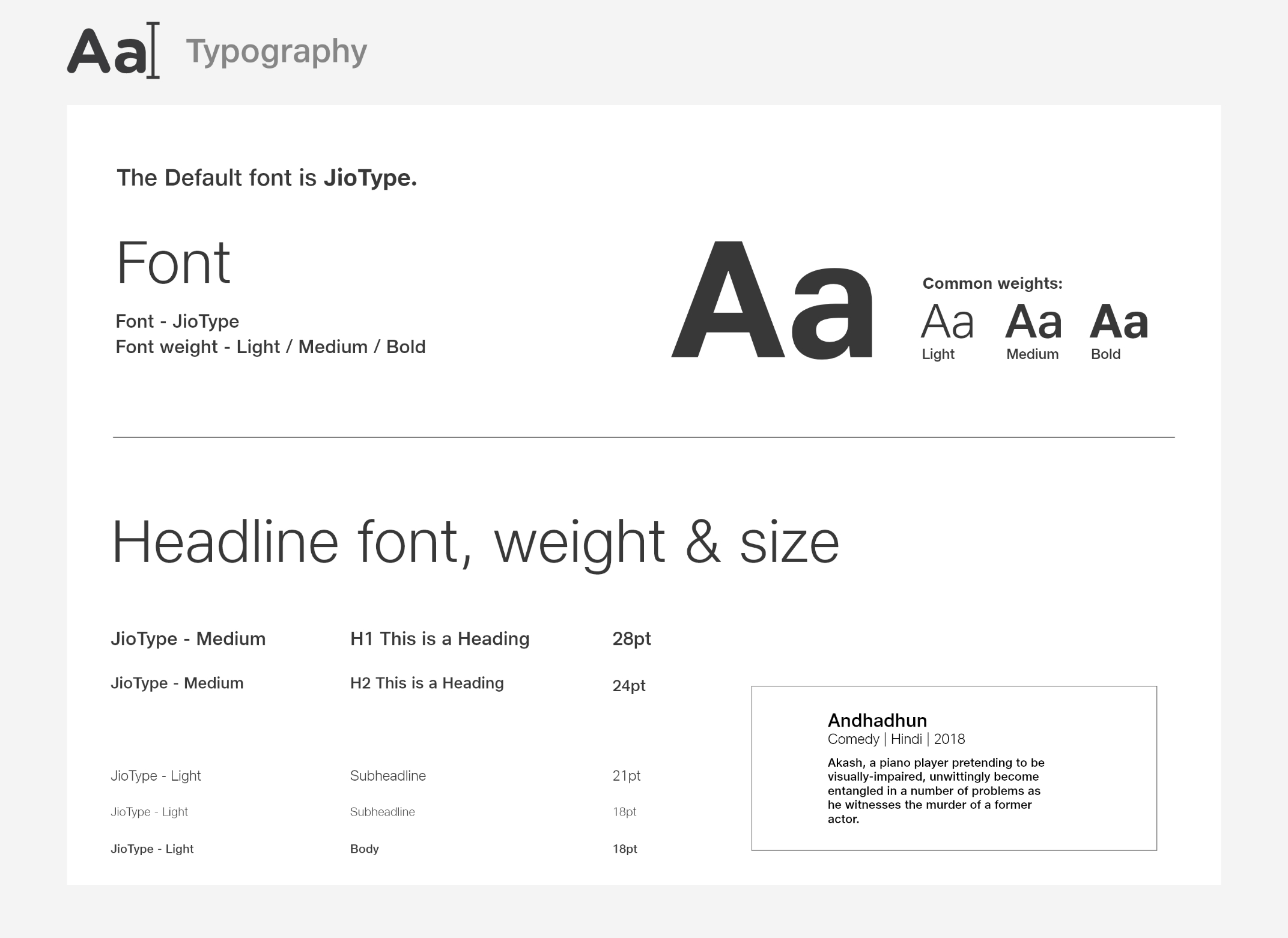
I knew this will be a long continuous project with more flows getting added with every release. So visual consistency would be needed, and the best way to achieve this was to set up a style guide and a design system. I followed the atomic design method and started designing atoms and molecules. I intentionally chose a simple style so that its scaleable and flexible and is aligned with the brand identity.
Typography
See more
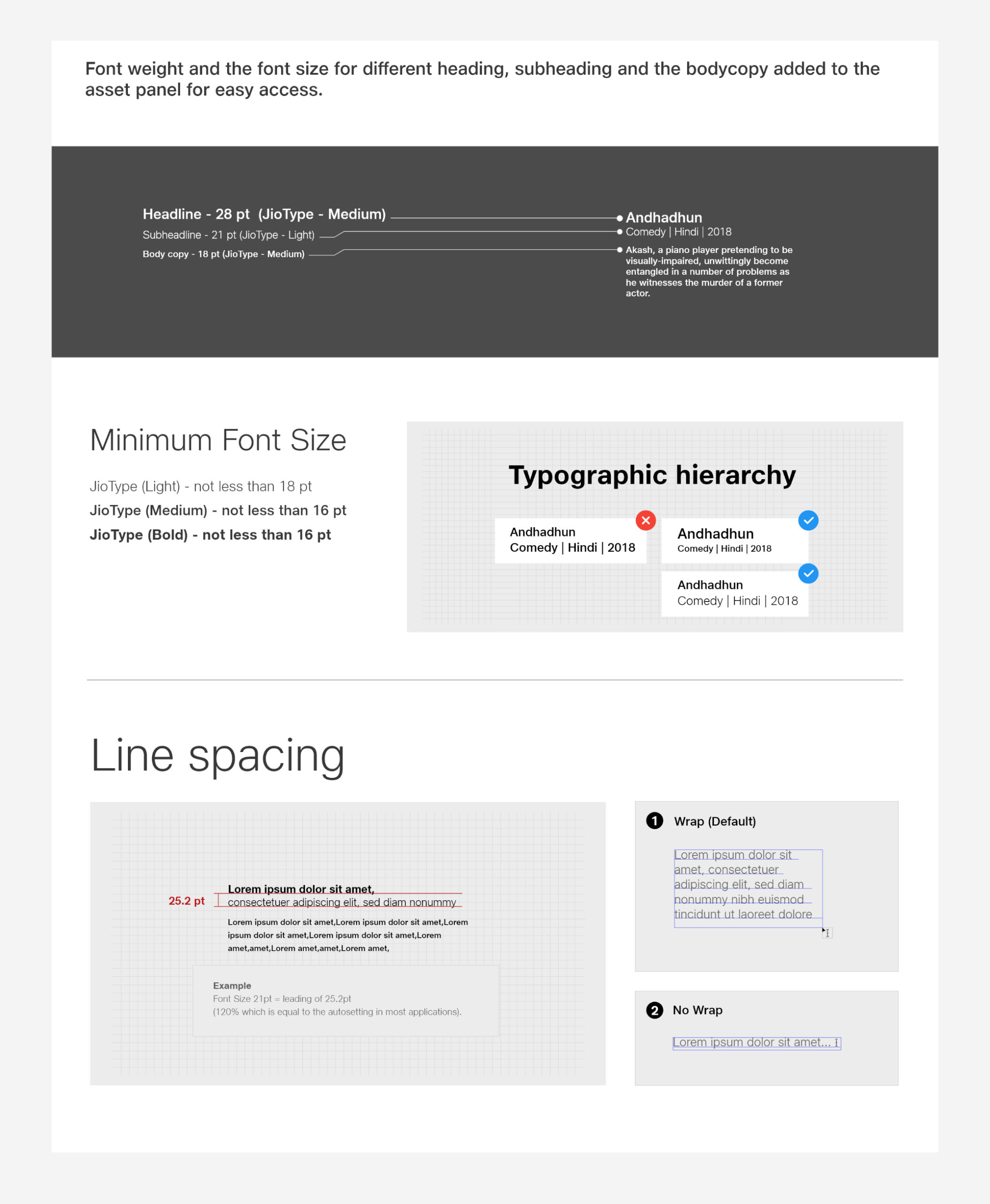
Design System
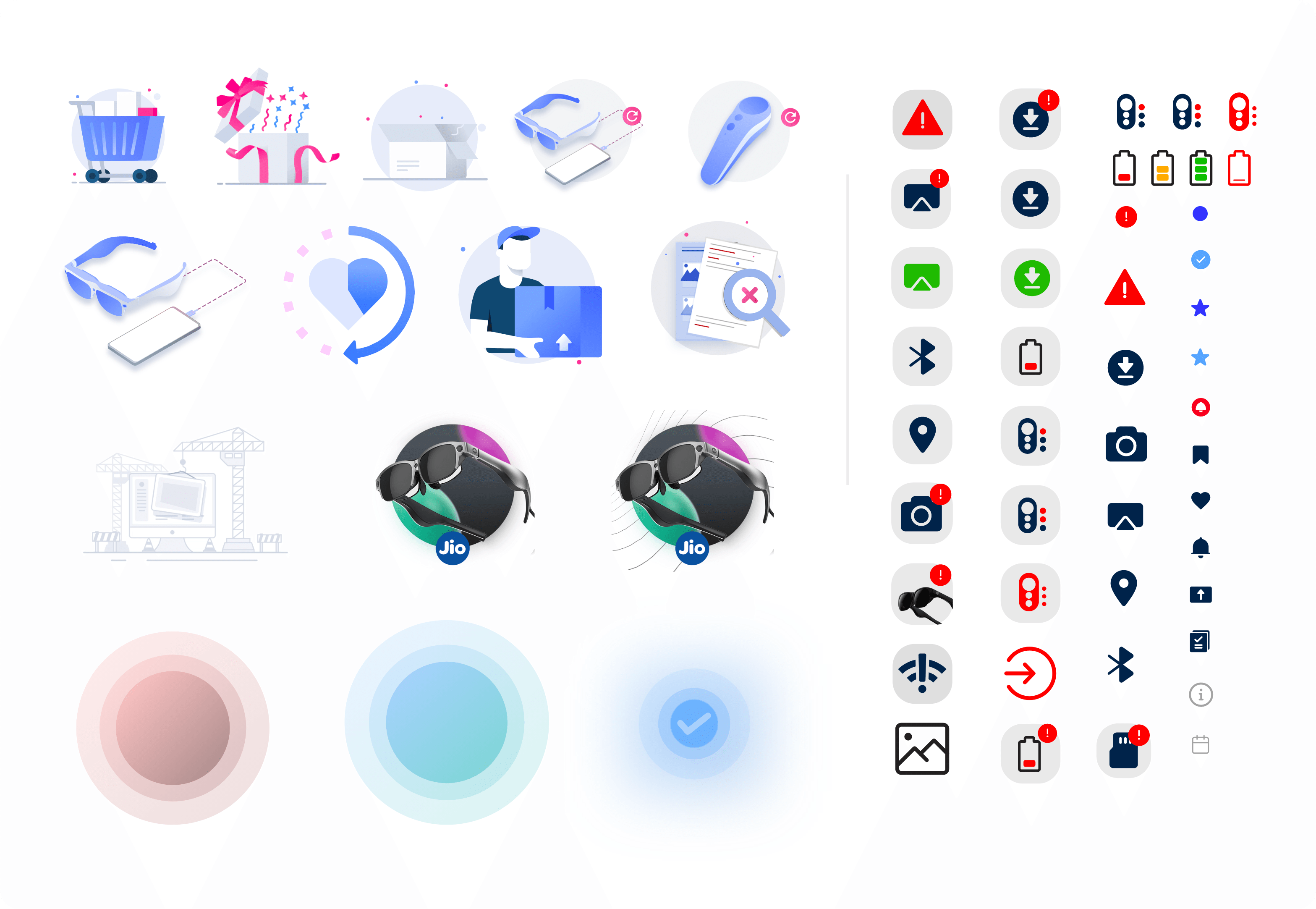
Illustrations & Icons
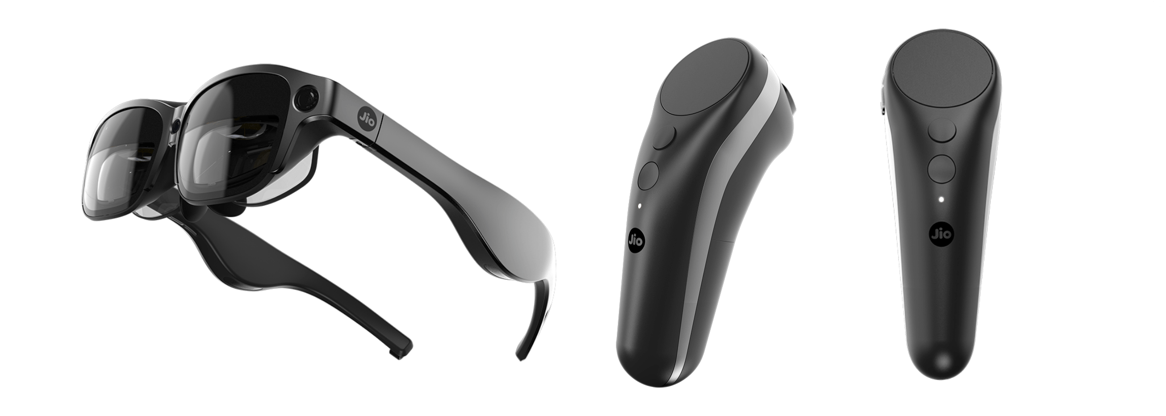
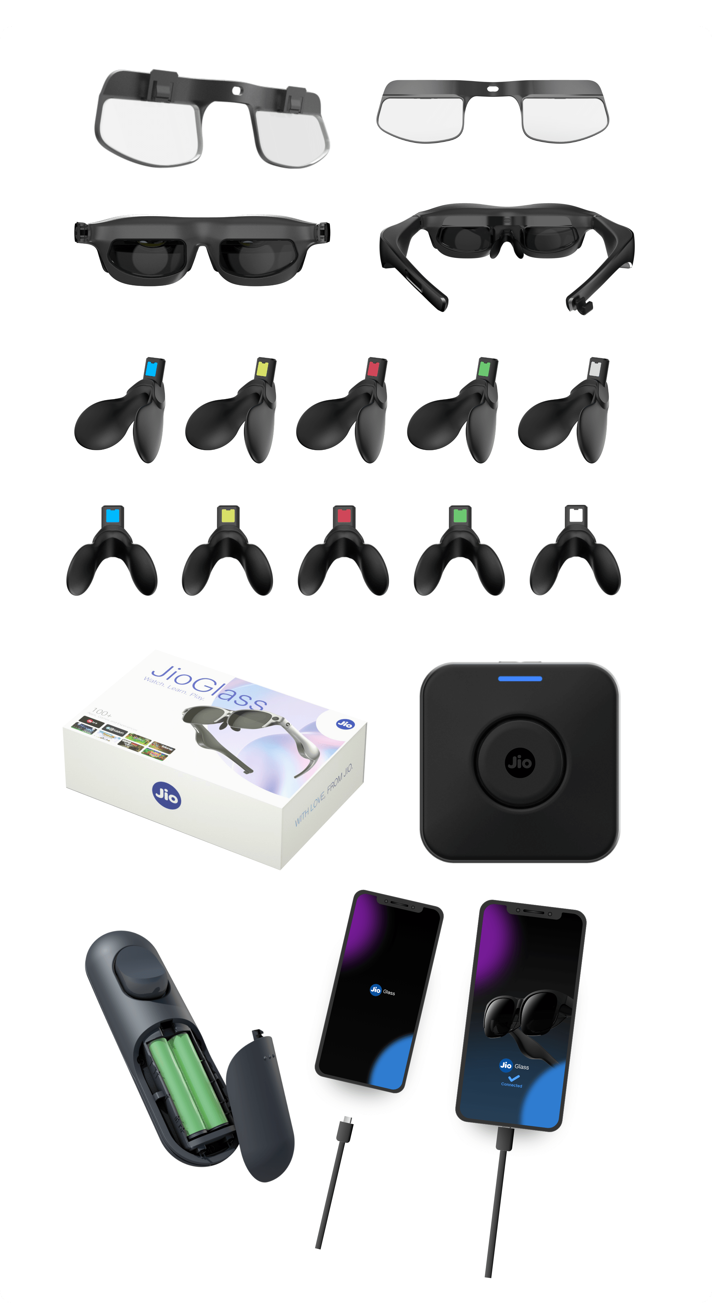
Product Renders
See more
Visual Design
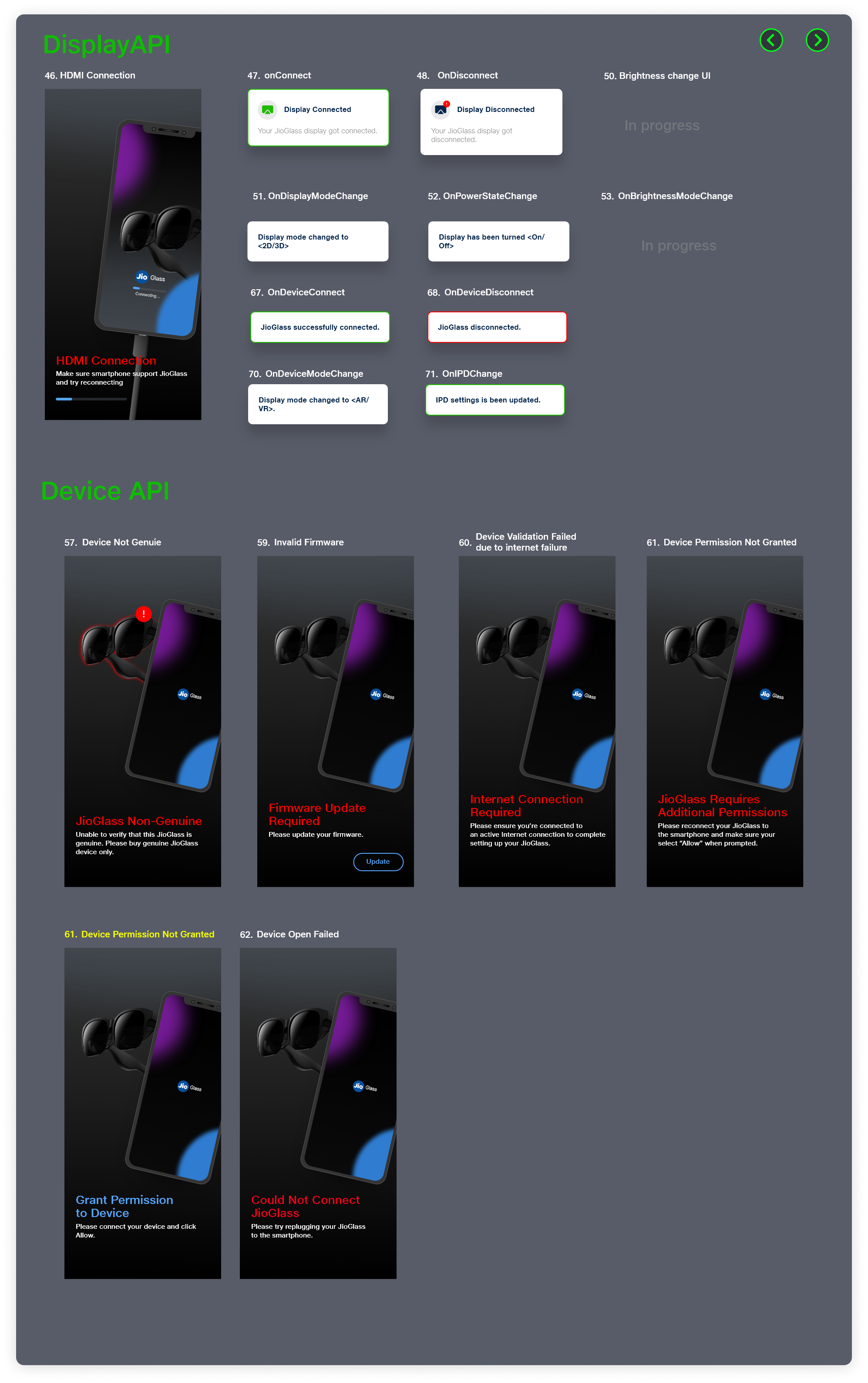
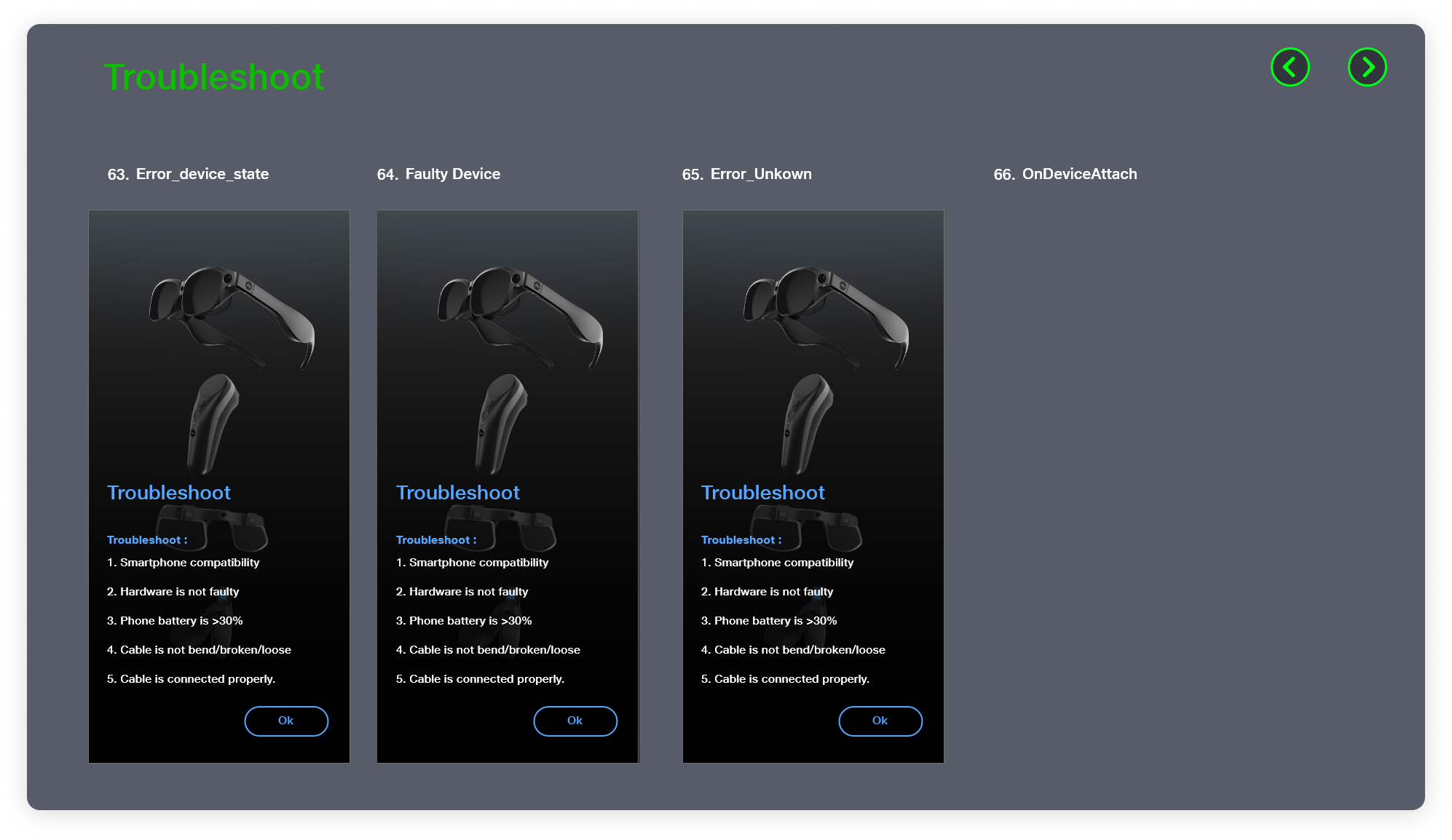
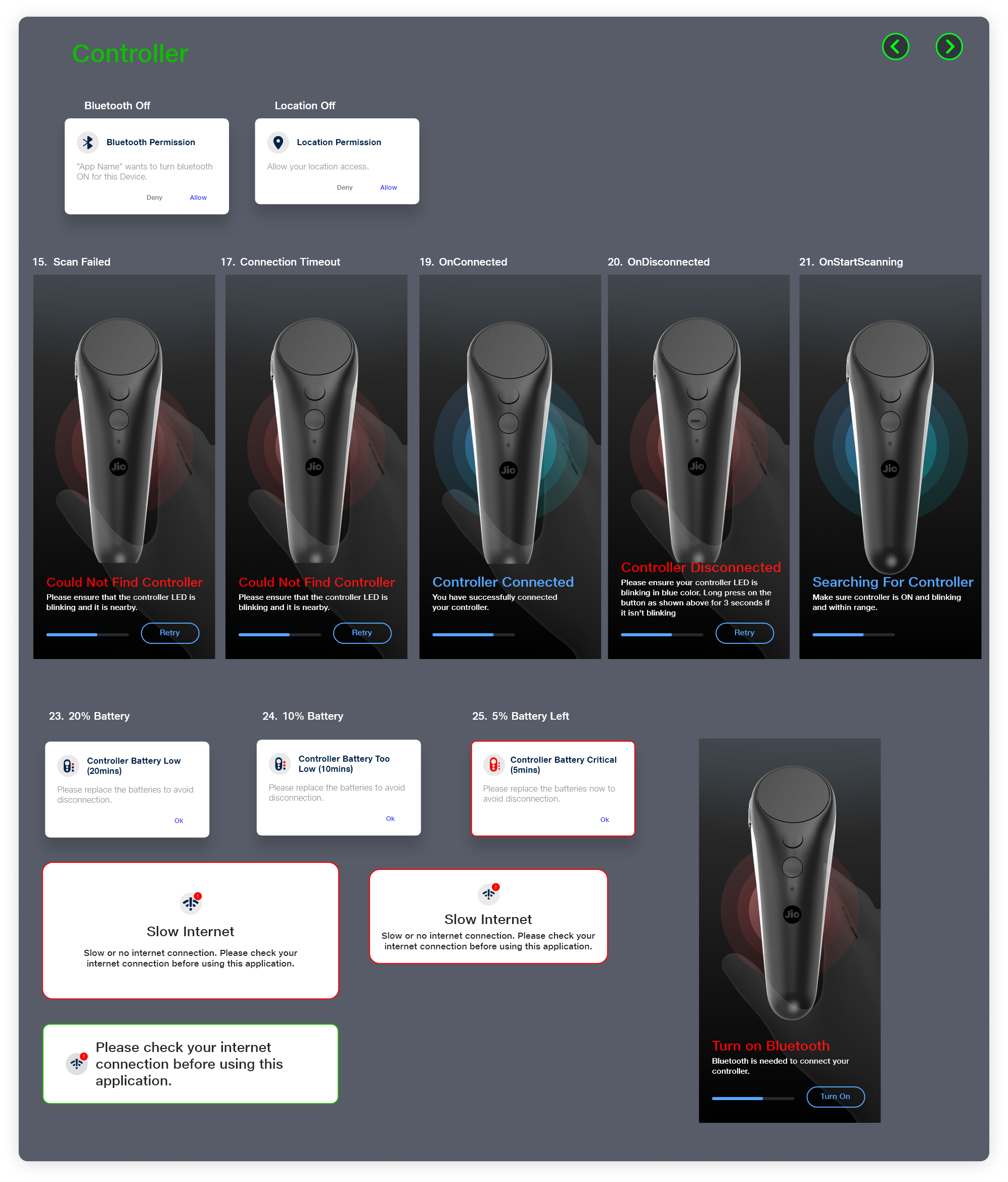
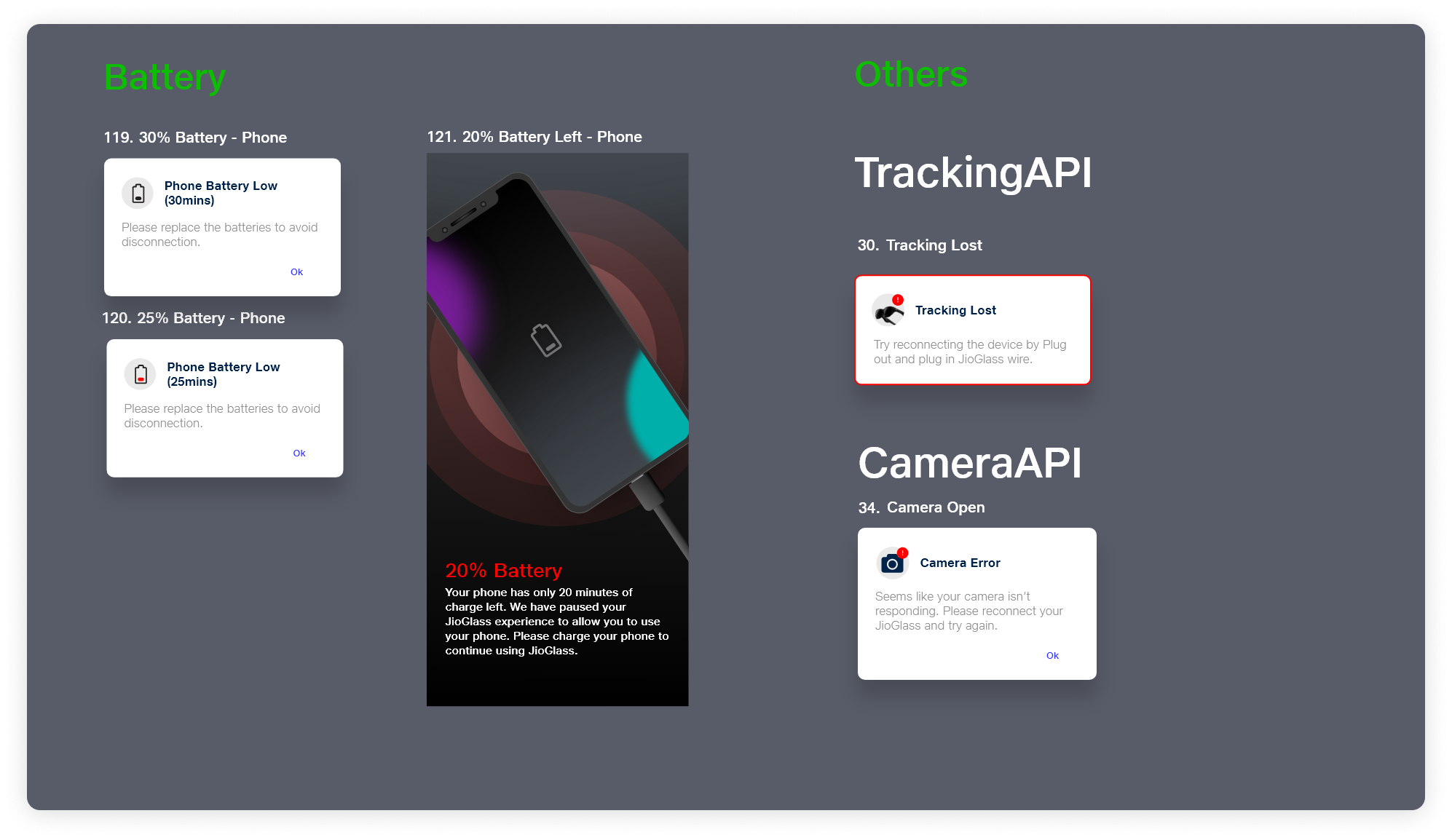
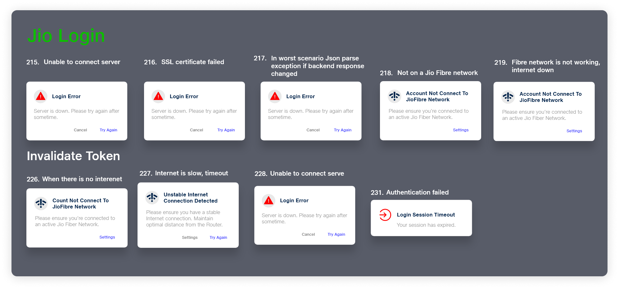
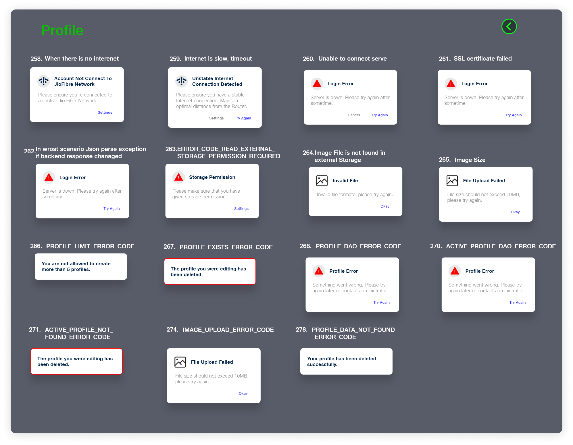
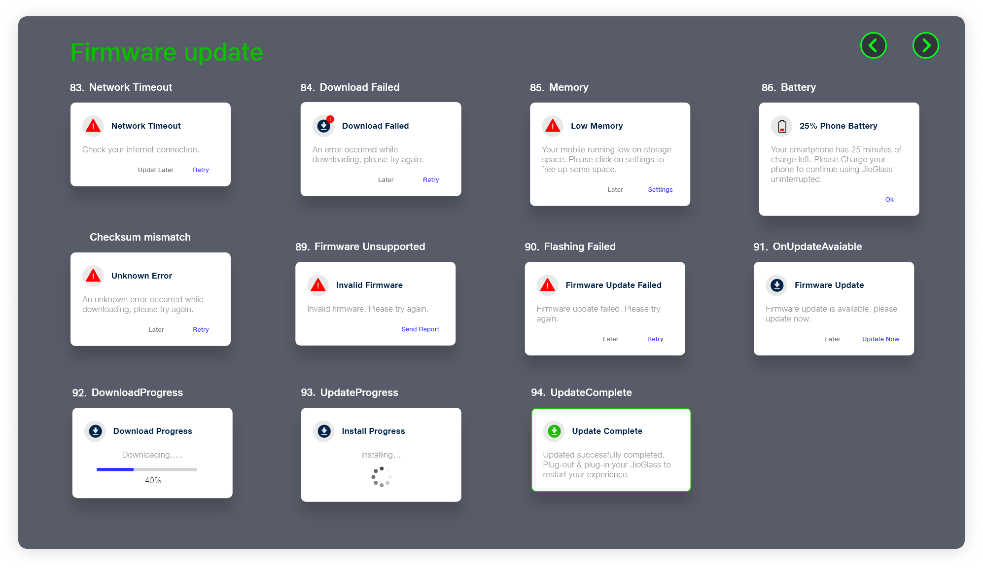
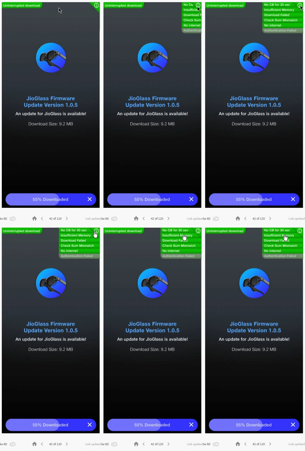
Armed with the style guide, I started the visual design process. Initially, I just focused on happy flows. Once they were done I moved on to loading states, empty states, negative flows, and error pop-ups.
High Fidelity Frames
Empty states
Loaders
Errors and Pop-ups
Prototyping and handoff
Prototyping the UI was and is my favorite part of the whole process. This is where everything feels like it’s coming together. Coming from a background in animation, the process of prototyping in Adobe XD felt very similar.
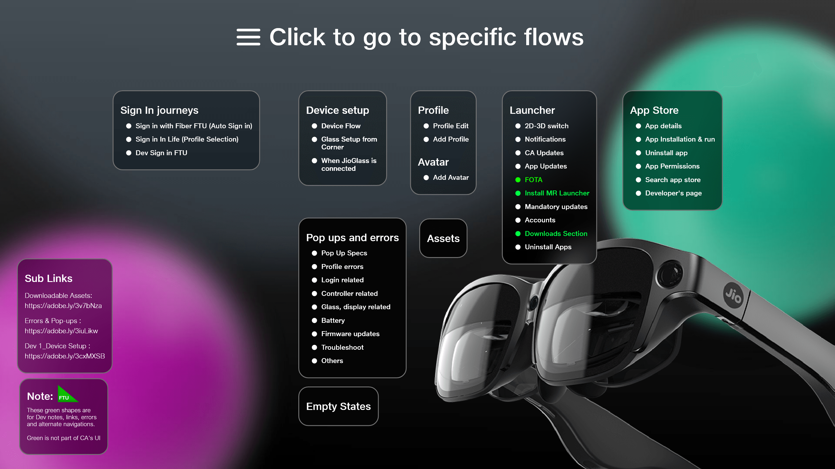
I prototyped multiple flows and tried to simulate the actual working app as much as possible. I soon realized that this was not a feasible approach. So I broke down the prototypes into different flows and made an index of flows which became a master page from where viewers can experience multiple flows.
This was especially useful to the stakeholders and folks from upper management as they did not have to go through multiple URLs. Everything was consolidated into one single URL and they could navigate, test, and give feedback quickly. For developers, I created independent URLs too so that each developer can focus on only the flow they are responsible for.
Handoff
For Handoff, I would have loved to use Zeplin, but it was not in the project budget so we had to get creative with Adobe’s limited tools for hand-offs. I exported every asset that a developer would need manually and set a cloud folder for exchange and updates on the assets. This way, if for any reason an asset had to be updated in any shape or form it would automatically be updated in the code too.
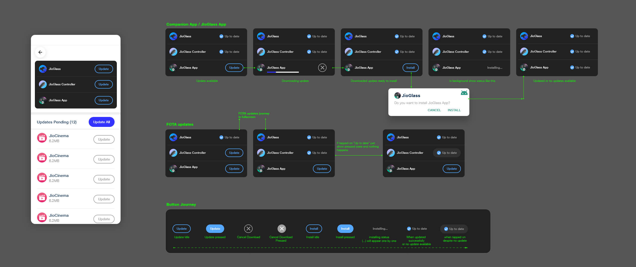
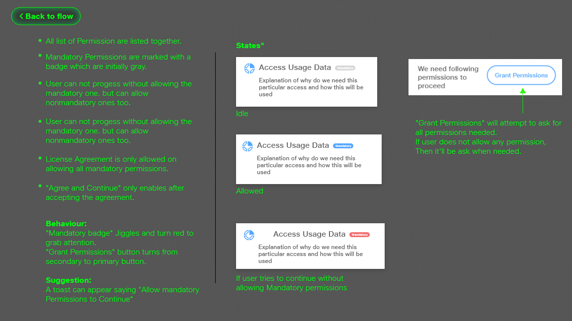
For a few UI patterns, I attached explanatory notes on the prototype itself. We developed a style and chose bright green and black colors to be identified as notes because these colors were not part of our design system. We used this method to prototype alternated journeys of a flow and add any explanation I thought developers would need.
examples
Complete app demo
Impact & Takeaways
We completed the development of MVP. It was a parallel development of the JioGlass Android app and the MR Launcher Unity app that would work in conjunction to provide the user with an end-to-end MR ecosystem experience. Now that we had a functional working prototype along with hardware manufactured we were ready to conduct some user trials.
Impact
- The whole product was ready to be showcased end to end, with a few Mixed reality experiences integrated, for stakeholders. This helped Tesseract Imaging gain new funding from Reliance Jio to further continue on this product.
- Got the product to a stage where it was ready for user trials so that we can vet the product and the product segment in an untested Indian market.
- We were in constant communication with the hardware engineering team and had frequent discussions about the complexities of the current version of the device. By the time we reached the alpha version, the hardware team had made lots of improvements making the device way less complicated.
- Established a robust design system across all design environments like physical product design, product packaging, marketing, and of course app design. The design system was codified for native android as well as adopted as a unity toolkit for a consistent look & feel across all touchpoints.
Takeaways
- This was the first time I ever worked on a mobile UI. I had to learn a lot of new concepts and work with a different kind of development process than what I was used to comparing to game development. Responsive design was the most challenging but important thing to learn to support various android phones.
- We worked with a lot of assumptions that we kept internally testing but knew that is not representative of a real user. We had to wait till the completion of MVP to gain real feedback and insights. I would have liked to work with a UX researcher with proper research if budget and time allowed.
- I learned not just about the digital but also the physical aspect of a product. or a physical product the customer journey is much more elaborate than digital products. Even things like product packaging and the unboxing experience are extremely crucial for a good customer experience. These things set mental precedence about the product affecting its success.
- Building a design system rather than organic UI design. When designing for XR products, the first impulse is to build sci-fi interfaces. But I learned to understand the target demographic and accomplish the company’s goal of making XR accessible by sticking to established and familiar UI patterns.

